


Sometimes there is no need or room to improve upon greatness. Take the bow hull form of QE2. At the time of QM2 construction, QE2 had 35 demanding years of handling the Atlantic Crossing schedule under her belt. Stephen Payne, QM2's Naval Architect has admitted that they essentially copied QE2's bow, scaling up the shape with the only modification being the more modern extended bulbous bow below the waterline. As a further nod to QE2, the center portion of the bridge windows are angled forward in the QM2 fully enclosed bridge design and the window frames blacked out similar to QE2's familiar bridge structure. QE2's DNA has successfully been transferred to the new Cunard Flagship, Queen Mary 2.


When it was announced the new Elizabeth would be another clone of Queen Victoria, I had hoped for a bit more individuality on the exterior of the newbuild. Instead, we got the same, with a bit more ugliness at the stern with additional cabins added to an already squared off stern. Even then, this was not unique as this had already been done on the HAL Eurodam and several Costa ships.
While I am in this Vista bashing mood, one thing that has bothered me since the Queen Victoria was unveiled is the "fake" sheerline, done in paint to mimick the hullform of another Cunard ship. This division from Federal Grey to White on the hull of the QE/QV design has as unappealing flatness and unnaturalness in an attempt to replicate the shear of QE2's hull, which is further highlighted with the placement of the name on the bow and the unequal amount of white visible below the name. Holland America ships which share the same hull and similar dark hull/white superstructure treat this area different and, in my opinion, in a more pleasing fashion to the eye.

Why do I dwell on the exterior of these ships? As an Architect, I have been trained to design to not only satisfy the program requirements of the end user, but to also impart a sense of beauty to the design which will be experienced by all. Beauty and proportion go hand in hand, but there is also a functional aspect of design that cannot be overlooked. For instance, while Frank Lloyd Wright's Guggenheim Museum in New York City has great sculptural beauty from the exterior, as a museum to view art, it has its shortcomings with its interior ramp design.
Great design is timeless and is comprised of many layers of allure as one of the partners of the firm I work at often opine that we, as designers, should be striving to achieve. Satisfying and appealing to us on many levels over time, good design will become cherished. Like certain buildings, ships such as Queen Mary and Queen Elizabeth 2 have become cherished. Decorating styles will change, but the backbone and layout of the building, or ship for that matter, must be sound. QE2 was lavishly designed in every detail and proportion, smartly laid out, and stoutly built by proud Scots. I think the results speak for themselves.
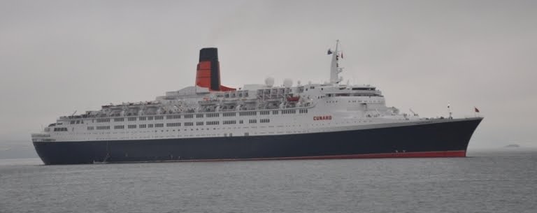
 QE2 - there will never be another.

Love that last photo - brings a tear to the eye - absolutely beautiful. Agree totally with what you say about the QE/QV but, unlike you, I can't bring myself to travel on them - even if I could afford to!!
ReplyDeleteRob, perhaps I've overstated my enthusiasm a bit. It's not like I am pouring over the QE/QV itineries to see what is interesting and what could fit into a vacation schedule, unlike what I used to do for QE2.
ReplyDeleteThey don't build them like the old girl R.M.S. Queen Mary anymore do they? just reading this makes me want to take my kids down to see the Queen for a little while, but maybe tomorrow.It's really hot here in L.A. today.
ReplyDelete