

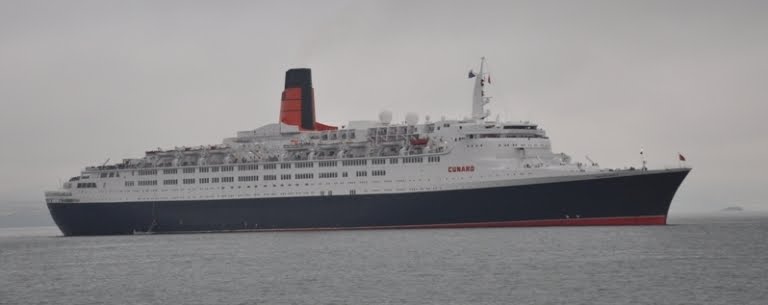
Back in 1967, the choice of using Helvetica for the font for the name of Queen Elizabeth 2 was completely logical. Cunard wanted a clean break from the previous Queens, designed in the 1930's with Art Deco style interiors and exteriors not too far removed from the days of Titanic. QE2, right down to the logo, would be revolutionary, new, hip, and a clean break from tradition. Even the funnel was modernized down to a sleek thin appearance, without the traditional Cunard red and black colors. She was sleek and all modern. The Helvetica font used for the name was a perfect fit. Picture Austin Powers dancing in the corridors. Groovy baby!

QE3 Gill Sans Font -photo courtesy of Cunard
The soon to be launched Queen Elizabeth (3) is NOT carrying on in the tradition of using the Helvetica type font in her name. Gill Sans is similar upon first glance and used today extensively in the corporate world, but something alway looked a little off when I viewed these names on the new Cunard ships. Actually the the Helvetica font was ONLY used on QE2. Queen Mary 2, QE2's replacement, uses the common Gill Sans font in her name as well as Queen Victoria. Graphic artists can spot the difference instantly. Not so with the masses and the new breed of Cunard passengers guests.


Thats quite fun to learn, i must admit it is not a thing i think much about, but now i come to look more closely i can see the QE2 had the more dynamic font style where as the quirky little tail on the Q on the latter passé
ReplyDelete