 This phrase reminds me of the advertising for the Triumph TR7 that was used in the late 70's to describe the radical for the time wedge shape of the new sports car from the British automaker British Leyland. The radical shape provoked a love it or hate it reaction. Coupled with the dreadfully poor build quality of the cars, the Triumph nameplate disappeared in the United States in the early 80's.
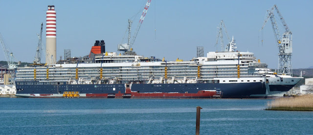
When Cunard announced they would be building a replacement for QE2, the speculation was that the design would be a derivation of the Queen Victoria design. QE3, the third Queen Elizabeth, would later confirmed by Cunard to be a true sistership to Queen Victoria, but which some changes. For myself and countless other QE2 devotees, this would prove to be an utter disappointment, expecting more from Cunard. QE2 was a radical design and trend setting when she was launched in 1967. She would showcase the latest design trends, featuring prominent British designers, and she was a shock to many accustomed to the Art Deco interiors of the original Queens.
Cunard, in choosing to name new the ship Queen Elizabeth, is harking back to the Art Deco designs of the original Queen Elizabeth, in a retro style, and is taking no chances here with cutting edge interior design. You could see this coming with the interiors of the Queen Victoria, which are done in a heavy retro Victorian theme. Having not seen either ship yet in person, I will reserve any further judgement. Having experienced the "over the top" Joe Farcus interior designs on the Costa Magica as my other cruise ship experiences, I suspect the Princess interior design team will provide a much more classy, restrained elegance experience throughout the ship. Perhaps the Art Deco influences will be handled well, but I am concerned that they may go the Disney route here and do a watered down poor impression of Art Deco.
My biggest disappointment with the new QE3 lies in the fact that the new ship will not be trend setting or special in any way, but more of the same from Cunard, who are playing it safe with the retro "liner" theme. I can understand why the ship will not be built for the speed and sea-keeping abilities of a liner. QM2 is handling this market well. I can also understand using a proven hull design to save on engineering costs. Both the Queen Victoria and the QE3 are variations on the proven Carnival Corporation Vista hull design. But I had higher expectations that there would be more customization of this design to make them unique to Cunard. Perhaps additional engines for additional speed when desired. Perhaps a different bridge design. Perhaps some modifications to the squared off stern. Perhaps even a Tyfon horn sound to remind us of QE2.
Instead, the Queen Elizabeth is getting additional cabins, similar to the sistership HAL's Eurodam, which does not make the already rather ugly stern profile any prettier. Gone is the stepped down liner-like profile of the Queen Victoria in favor of additional cabins and smaller balconies. Adding to this, the area above the bridge on the QE3 is roofed over for indoor sporting activities, which adds additional mass high up on the profile. While I am looking forward to using this space, it does look a bit tacked on from the photos that have been posted.
The mass expanse of the bridge, extending low across the bow, does not appear to have been changed in the slightest from the Queen Victoria design. Once again, I was wishfully thinking that Cunard would have made at least a few subtle changes in the design to pay homage to the greatest ship in the world that preceeded the current design. Also missing, will be the open observation deck I spent so much time braving the elements on QE2.
One of QE2's sleek, almost sinister features I loved to photograph was the blacked out bridge window area with the forward sloping glass. Blacking out the vast expanse of window mullions across the bridge would go along way to improving the look here.....hint, hint Cunard.
Despite these changes and cookie cutter approach to the design, with the Cunard colors, QE2 inspired funnel and foremast, QE3 will still look better than most other cruise ship sailing the seas. QE2 was stunningly beautiful at any angle, with perfect proportions. She was designed in a different time, without the emphasis on balconies and interior volumes and amenities that the cruising public have now come to expect. Wherever I look on QE2, I see evidence of designers spending time to get every detail and proportion just right. Unfortunately, I just do not see this in QE3.
QE3 is the shape of things to come, personifying the trend to maximize what the ship contains inside while striking a compromise with the exterior aesthetics of the ship. Like the TR7 car design, it's a love/hate reaction to those familar to QE2. I'm just not in love quite yet. We're booked on the Maiden Tandem Crossing in January 2011 and I suspect that may change once we're onboard after a two years absence from Cunard. The temptation to make comparisions to QE2 will be still be hard to resist.


I hope they handle those Art Deco influences well.
ReplyDelete