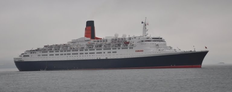
The legendary Cunard Queen Elizabeth 2 on the Hudson River in New York City, October 16, 2008, as she departs for the final time.


10 March, 2011

Cakewalk

Cakewalk photo courtesy of Derecktor Shipyard

Why am I featuring this strikingly beautiful yacht here?   First, this yacht was constructed in Bridgeport, Connecticut of all places, not in Europe at one of the more famous yards noted for their mega-yacht builds.  Derecktor Shipyards has constructed the largest yacht built in the United States, and it was built in my home state!  In fact, it was practically constructed under my nose, yet it completely escaped my roving eyes until it was launched.

Since 2004, I have been making a regular trip to Long Island for my project at Cold Spring Harbor Labs, taking Interstate 95 into New York City in the very early hours, spending the day out on Long Island, and then battling the traffic home in the afternoon.  The Derecktor yard is readily visible from Interstate 95, but most times, it was either too dark to notice on the drive in, but quite the opposite on the return drive.  Often, with traffic at a crawl, I could get a good long glimpse of the yard, usually filled with various commercial craft with the occasional large yacht.  Sometime in the spring of 2010, during one of my return trips, the door to the large shed was open and I recall wondering just what I saw inside.  It was definitely a large mega-yacht, but it was a puzzle what it was doing in this yard at this time of year when it should be off cruising in warmer waters.

Fast forward to the summer of 2010.  August 10, 2010 would be a special day.  I had to make the usual trek in to the Lab to deliver drawings and take as-built measurements and photographs of a new project on the campus.  I would not be accompanied by anyone from work, but instead with my son Ryan, who would get to see what I have been working on for such a long time.  With absolutely perfect weather, we drove in and made haste in performing my tasks, with Ryan getting his first taste of holding the "dumb end" of the tape.  He was clearly not impressed with the job, but I promised we'd go for a tour of the the newly opened Upper Campus Lab complex.  If we did not spend too much time there, we could drive further East on Long Island and pick up the Port Jefferson Ferry for a different way home.   Of course, I was detained a bit in the building since I ran into the contractors, who were still working on final touches.  It would be a close call to make it on the ferry.  We ended up being the second to last car to board the ferry and it was departing the dock before we could get out of the car.  It was then I told Ryan that if we missed it, we'd have had to wait another full hour for the next ferry.

For me, I cannot pass up any opportunity to get on the water and today, we were going to take the Port Jefferson Park City car ferry back to Bridgeport, Connecticut, making the short trip across Long Island Sound.  While not much of a time saver since the ferry is NOT one of those high speed jet drive catamarans, we were back on the water with picture perfect weather to boot.  Ryan was quick to point out that this was actually the first time the both of us had been back on a ship since our final trip on QE2 in October of 2008;  way too long to be away from the water.

Now there's a familiar shot!  Yes, the Park City has exposed bridge wings and those life raft canisters are so reminiscent of those on the rear deck of QE2.

I've taken this ferry several times before for work, and today, the seas were like glass, unlike the last time, which I recall was shortly after my QE2 January 2008 Transatlantic Crossing.  Winds were howling and the shallow depths of Long Island Sound whipped up the seas for an interesting hour long trip.  Plodding along in seas maybe 10 feet high, she was rolling considerably.  Co-workers ribbed me when I had to shut the laptop and go up deck for some air.  I make an Atlantic Crossing in January without incident, but I go green on a little jaunt across the Sound in seas that weren't that bad...go figure.

Today was the complete opposite; very warm, little wind, and dead calm seas.  Still, there was that smell of salt air and the occasional whiff of diesel exhaust from the funnel.  Call me crazy, but I just love the smell of diesel exhaust and sea air!  Yeah, I love the smell of diesel in the morning too.....Granted, the smell is a bit different that the heavy bunker grade fuel used on cruise ships such as QE2 or QM2, it still is a "good" smell to me.

The Park City appeared to be twin screw, but from way it maneuvered and all the noise and vibration felt in the deck below our feet, it appeared to have bow and stern thrusters.  There would be no tug assists on this mini "crossing" of sorts!

To the left, Ryan's doing his version of a "funnel run,"  something we never got to experience on QE2.


Reliving our favorite moments on QE2 spent watching the sea from the "bit beneath the bridge", we made our way to the same spot on Park City.  She's got a bit of a different foredeck for sure since the bow swings up to allow the cars below to exit upon arrival.  Still, with the wind on our faces, we were approaching port, but not anticipating any crowds cheering and waving as we approach the pier.  The chimney stack in the distance is the power plant located in Bridgeport harbor, our final destination, which seemed to take forever to arrive at.  Park City is no speed queen!  I asked one of the deck hands what her cruising speed was, and he stated it was 16 knots.  It felt more like 10.

Bridgeport harbor is very much a working harbor, with Derecktor Shipyard and other commercial piers, mainly with local fishing boats tied up.  As we made it into the breakwater, Derecktor's appeared off our starboard bow, with a large floating drydock and boat shed dominating the horizon.

Just beyond the drydock, I could make out a large yacht.  We were going to get a closer look as we approached the pier and perhaps I could make out a name.

What was this thing?  It was very out of place for here I thought.  Perhaps the yacht had to make emergency repairs.  This is a Derecktor yard, who's other yard in Newport was famous for America's Cup racing sailboats, most notably Dennis Conner's Stars and Stripes, which successfully brought the Cup back home to the States.  It never occurred to me they would actually build a yacht of this caliber here. 

Wow!  What a striking profile and pleasing set of lines, but no name yet.  Today was August 10, 2010.  Incredibly, the yacht was only launched two days before on August 8th.  I'd have to wait several more months until I saw a write-up of Cakewalk in a boating magazine to find out the details of this very special vessel.  Cakewalk was proudly built by this Bridgeport yard by local craftsman, hidden away in the large shed during most of her construction.  She is 281 feet long and is the largest yacht ever built in America.  Check out more beautiful images on her own website.

Still following along and wondering what's the real significance with this yacht and QE2?  Interestingly, the yacht's hull is constructed in steel, with her superstructure done in aluminum, just as in the case of QE2.  The mirror-like finish of the steel hull is a testament to all who labored on her construction.  Cakewalk had both a yacht designer and a naval architect, as well as an interior designer on the design team, similar to QE2's design team.  Designer Tim Haywood crafted the look of the yacht, with the naval architecture handled by Azure Naval Architects, and interior design by Dalton Designs. 

Tim Haywood previously worked for over 20 years for Jon Bannenberg Ltd., a designer of megayachts and whom QE2 fanatics will recognize as one of the designers responsible for some of the interiors of the original QE2.  While Tim did not work for Jon at the time QE2 was on the drafting boards, he worked with Jon before his death and influence of his style is very much evident in the lines of Cakewalk.  More on his bio and clips can be found here.

Azure Naval Architects, responsible for the hydrodynamics and engineering of the yacht, are located in the Netherlands.  Unbelievably, they too have a QE2 connection.  Browsing their website, low and behold, there was a photo of QE2 in their projects section, listed under "refits."  Apparently they were hired by Nakheel to perform engineering for the yet to be accomplished, hopefully stillborn, plan to convert the ship to a floating hotel.  Note to self;  contact them for a future blog post if they are willing to divulge any details on their QE2 project.

August 10th would not be the last we'd see of Cakewalk, however.  During our January 2011 Caribbean Calypso cruise on QM2, I recognized the distinctive blue hull while on our way to the aerial tram in St. Thomas.  There she was in the harbor, off the bow and dwarfed by the futuristic looking Ruby Princess and sharing the pier with NCL's butt ugly Norwegian Jewel.  Queen Mary 2 can be seen off in the distance at the Havensight pier in the aerial photo.  (This deepwater pier was not built at the time we called at this port on our first trip on QE2 in 2000.  QE2 anchored between the islands and we tendered in to the pier.)

While on the tram, we witnessed the Ruby depart the pier unaided, churning up the sandy bottom, and giving us a bird's eye view of our Connecticut built mega-yacht Cakewalk.  This time, her name was clearly visible.

Cakewalk is available for charter for a cool million a week.

01 March, 2011

QE's Funnel Comes Up Short

Photo to left, QE2's funnel, taken from the rear.  Photo to right, QE and her captain, courtesy of Cunard's Facebook page.

What happened here Fincantieri, designers and builders of Queen Elizabeth and Queen Victoria?  Why does the funnel casing stop short of the engine exhaust uptakes?  Even the arrangement of the uptakes is untidy.  They're not symmetrical, but who notices these little things except ship nuts like me?  The builders managed to do this on other similar Vista Class ships they have built for Holland America Line as well, but then again, they were not tasked to replicate the QE2's iconic funnel.  Okay, so they probably were not asked for a carbon copy, but a modern interpretation of what the world has come to recognize as distinctly QE2 and in effect Cunard.  The vertical ventilation slots are there on QE's stubby funnel, but we're just missing the top row!

I have yet to hear a rational reason why the casing must stop short.  The argument that I have read elsewhere is that it is an aerodynamic/functionality issue.  That explanation falls on its face when you look at Queen Mary 2's beautifully designed, if not a bit vertically compromised, funnel.  You can just make out the large, well concealed gas turbine uptakes from this photo.

Notice the similarity to QE2's funnel below, abeit abbreviated due to that damn Verrazano-Narrows Bridge height restriction!

QE2's iconic funnel in the early morning sun off the Isle of Man, October 3, 2008 ( photo mirrored for comparison to QM2's funnel)

For a more in depth discussion on the subject of QE2's funnel, including a comparision to the new Queens, visit my favorite QE2 website here.  From a link in this discussion, here is an excellent side by side comparision of QE2's magnificant funnel compared to the stubby versions on the new cruising Queens.  Looks like I need to practice some Photoshop editing here to illustrate what these funnels could easily have looked like! 

Photo courtesy of Albireo2006 found here on Flickr.

26 February, 2011

QM2 Foremast Design

Queen Mary 2's foremast, as seen theatrically lit at night, was inspired by the original on Queen Elizabeth 2.  What's most different from the QE2 is that the ship's Tyfon's are not located here, but on the funnel on the Mary.  I love how the ship is lit up at night for maximum effect.

Bridge Design Evolution of the Queens

For this excercise, I am deliberately leaving out and discussion on the new Queen Elizabeth. In my opinion, there is no design evolution or connection with the previous Queens save for a near carbon copy of the QE2 foremast and a rather untidy rendition of QE2's iconic funnel.  Check back here for a future post on QE's funnel design.

Let's compare the original Queen Elizabeth bridge and forward superstructure design with that of Queen Elizabeth 2.  The similarities are striking when one compares photos taken at similar angles of the two ships. In retrospect,  I now find the QE2 design  more evolutionary than I had once thought.  The enclosed bridge, while present on the original Elizabeth, gets updated with a modern, futuristic flare on QE2, with the added feature of the forward raked windscreen.  Let us also not forget that the original QE2 windows were not painted out in black, but were painted out in a tan color.  In my opinion, the black accentuates the design and imparts a look that is more modern that the original color scheme.  In fact, Stephen Payne recognized this aspect of QE2's design and incorporated it into Queen Mary 2's bridge design, with the raked center portion and blacked out window frames.

The functional open bridge wings are evident in both Elizabeth designs, with the vertical supports still present, but tucked in a bit from the superstructure on QE2.  Cleverly, the ships running lights are integrated into these structures on both ships.  Both ships also have observations decks located below the bridge area; my favorite exterior place to be I might add.   Even the wind deflector device at the face of the open bridge wings is evident on both designs.  The forward facing windows became smaller and less in quantity in the QE2 design, but the intent of updating the Queen Elizabeth fenestration pattern is clearly evident, especially when you see what the original designers intended.

The current configuration of QE2, with the later appendage housing an expanded kitchen and resulting plating over of the taller existing forward facing windows on QE2 diminishes the outright comparison of the appearance of the forward superstructure with that of the original Elizabeth.  In fact, when I first laid eyes on QE2, I was surprised to see the lack of forward facing windows.  I am not alone in that I have never know QE2 without the modifications to the forward superstructure.  From these shots above and below of QE2 undergoing sea trials, it is clear that the designers were intent on an evolutionary, yet modern interpretation of the legendary original Queen Elizabeth, proudly built on the Clyde.


25 February, 2011

Pride of the Clyde Tartan

A Google search revealed that there is a registered tartan  called the "Pride of the Clyde."  I rather like the color combination. In fact, I had experimented with a background color when setting up this blog initially and it looks like I inadvertently got very close to the to the dominant blue color of the tartan.  I guess now I need to find a way to integrate this somewhere in the blog.


Developed by John Keogh of Keogh and Savage Gents Outfitters, Ltd. of Greenock, it appears to have been released in 2007.  Not much else was to be found online regarding the tartan, but I did find this press release.


A brand new tartan with echoes of the heritage of the river Clyde has recently been introduced by John Keogh of Keogh and Savage in their shop at West Blackhall Street in Greenock.


'As a child I grew up seeing the edges of the shipyards from my window and have tried to reflect this aspect of Inverclyde within the tartan we have produced', said John.  The blue stands for the ocean, with the vertical white lines suggesting the Greenwich meridian and the horizontal white the equator. The grey signifies the steel of the ships which went from Greenock to the four corners of the world. There was a time, you know, when 75% of the world's shipping was built on the Clyde. The thin blue lines represent the burner's torches I could see from my window at night while the thin white line represents the arc of the electrical welders at work.  Finally, the light blue signifies the sky's horizon.
We have made the Pride of the Clyde tartan kilts with extra pleats to help signify the waves of the Clyde when worn. We have also designed a special sporran to go with the new tartan using an anchor with a celtic cross effect and three ropes and a blue chain arc on the cantle.
Overall I hope wearers will feel that this new tartan is a celebration of the river and will wear it with pride. A number of kilts have already been sold while others are on order and hire arrangements for the new tartan are in place. We have sent material over to North America with the aim of getting the tartan well known there through the various Scottish Associations.


We also hope that the Pride of the Clyde tartan will be suitable and liked by families whose surname does not lead to a specific named tartan. There also may be some interest from a national media company.'

The new tartan is on display in the Keogh and Savage window in West Blackhall Street, Greenock.
From the Scottish Registry of Tartans website the GOvernment of Scotland's official site, http://www.tartanregister.gov.uk/tartanDetails.aspx?ref=3382, below is an enlarged view of the tartan.

20 February, 2011

DNA of a Liner


Sometimes there is no need or room to improve upon greatness.  Take the bow hull form of QE2.  At the time of QM2 construction, QE2 had 35 demanding years of handling the Atlantic Crossing schedule under her belt.  Stephen Payne, QM2's Naval Architect has admitted that they essentially copied QE2's bow, scaling up the shape with the only modification being the more modern extended bulbous bow below the waterline.  As a further nod to QE2, the center portion of the bridge windows are angled forward in the QM2 fully enclosed bridge design and the window frames blacked out similar to QE2's familiar bridge structure.  QE2's DNA has successfully been transferred to the new Cunard Flagship, Queen Mary 2.

Unfortunately, the new Queen Elizabeth shares no DNA with QE2.  None.  Sorry Cunard marketeers.  Her lines are not as fine in the bow sections since she has no need to run at speeds customarily associated with the Queens.  She and her sistership Queen Victoria are built for cruising.  Nothing wrong with that, but it irks me to no end when I hear all the doublespeak about these new ships being liners.  Now I was hoping at least they would paint out the window frames black in an attempt to dress up the Vista Class clone a bit more like her predecessor or even change the amount of glass used in the bridge.  At least try to make the ship look like one in the family beyond the color scheme and funnel design.  I suspect that might have gone a long way in making these designs more unique and as least looking more like the QE2 or QM2.  Here's what the Arcadia, the original Queen Victoria looks like with blacked out window frames.

Speaking of the funnel, I wonder out loud if lifting the funnel design with the uplifting airflow scoops off QE2 was really necessary, beyond marketing purposes for these new ships, QM2 excepted.  The ships are  never going to travel at QE2's speed, nor do any of the other many Vista Class clones have this feature.  They apparently have functioned for years without it.  In fact, when the first Queen Victoria hull was reassigned to P &O as the Acadia, they left off the scoops of the decidedly QE2 looking funnel.  Has anyone complained?

When it was announced the new Elizabeth would be another clone of Queen Victoria, I had hoped for a bit more individuality on the exterior of the newbuild.  Instead, we got the same, with a bit more ugliness at the stern with additional cabins added to an already squared off stern.  Even then, this was not unique as this had already been done on the HAL Eurodam and several Costa ships.

While I am in this Vista bashing mood, one thing that has bothered me since the Queen Victoria was unveiled is the "fake" sheerline, done in paint to mimick the hullform of another Cunard ship.  This division from Federal Grey to White on the hull of the QE/QV design has as unappealing flatness and unnaturalness in an attempt to replicate the shear of QE2's hull, which is further highlighted with the placement of the name on the bow and the unequal amount of white visible below the name.  Holland America ships which share the same hull and similar dark hull/white superstructure treat this area different and, in my opinion, in a more pleasing fashion to the eye. 

The reality is though, once on board, the exterior lines and proportions become secondary to the amenities and service that the ship provides for your vacation.  With that in mind, I am particularly looking forward to a cruise on the new Queen Elizabeth in the future in her updated Art Deco inspired interiors.  Perhaps I am just spoiled with the perfectly proportioned QE2, which I could not find a bad angle to photograph her from.

Why do I dwell on the exterior of these ships?  As an Architect, I have been trained to design to not only satisfy the program requirements of the end user, but to also impart a sense of beauty to the design which will be experienced by all.  Beauty and proportion go hand in hand, but there is also a functional aspect of design that cannot be overlooked.  For instance, while Frank Lloyd Wright's Guggenheim Museum in New York City has great sculptural beauty from the exterior, as a museum to view art, it has its shortcomings with its interior ramp design. 

Great design is timeless and is comprised of many layers of allure as one of the partners of the firm I work at often opine that we, as designers, should be striving to achieve.  Satisfying and appealing to us on many levels over time, good design will become cherished.   Like certain buildings, ships such as Queen Mary and Queen Elizabeth 2 have become cherished.  Decorating styles will change, but the backbone and layout of the building, or ship for that matter,  must be sound.  QE2 was lavishly designed in every detail and proportion, smartly laid out, and stoutly built by proud Scots.  I think the results speak for themselves.

QE2 - there will never be another.

19 February, 2011

Stephen Payne's Clever Nod to the Past

Although it has been over a month now since we left Queen Mary 2 in New York City, she is still revealing wonderful little secrets.  Uploading and archiving the several thousand photographs taken on the trip has been a daunting task, still not fully complete.  While performing some touching up on the above photo, I had the photo zoomed in detail and noticed something that completely escaped me while onboard.

Stephen Payne, Queen Mary 2's Naval Architect, had inserted a subtle reference to the former Queens in the railing projection at the stern of the ship.  Queen Mary and Queen Elizabeth, along with most other ships of their vintage, had rear observation wings or decks that extended out beyond the ship to aid in docking maneuvers.  Maybe there is a proper name for this feature, but I could not find one with a Google search.  Whatever you want to call it, it was as functional as the extended bridge wings in their day, allowing extended views down the length of the ship.  Today, I would venture this rear observation platform has been rendered completely obsolete with all the modern day communication and video devices in use on the ship. Seeing this feature in the photo while sitting back at home at the computer, I thought to myself "if only I had seen it on deck, it would have made for some very interesting shots taken looking down the hull." 

Digging further into my photos, I found the above photo and am dissapointed in myself here.  Amazingly, I had already captured this feature on deck one early morning.  Perhaps getting up early each morning to see the spectacular sunrises left me a bit groggy and oblivious to this feature.  Nevertheless, I am completely guilty of not seeing obvious things while being totally absorbed in the taking of the photographs.  Looking at this photograph now, it also appears that the railing to the left of the life raft running perpendicular to the outer rail was either bent or damaged as seen in the crooked teak railing. 

From the Wikipedia entry on Queen Mary, here is a cropped view of what Stephen Payne was emulating.  In the practice of Architecture, we often borrow from the masters that have proceeded us.  We have a fancy description for this practice;  precident analysis.  We look to the past to see what was done right or wrong by designers facing similar constraints.  We do this with the intent not to copy, but to build and improve upon the design if possible while imparting our own style. Here is but one of several subtle and not so subtle examples of this practice being brilliantly applied to the Naval Architecture of Queen Mary 2.  I will elaborate on further references to great liners of the past used here in future posts.